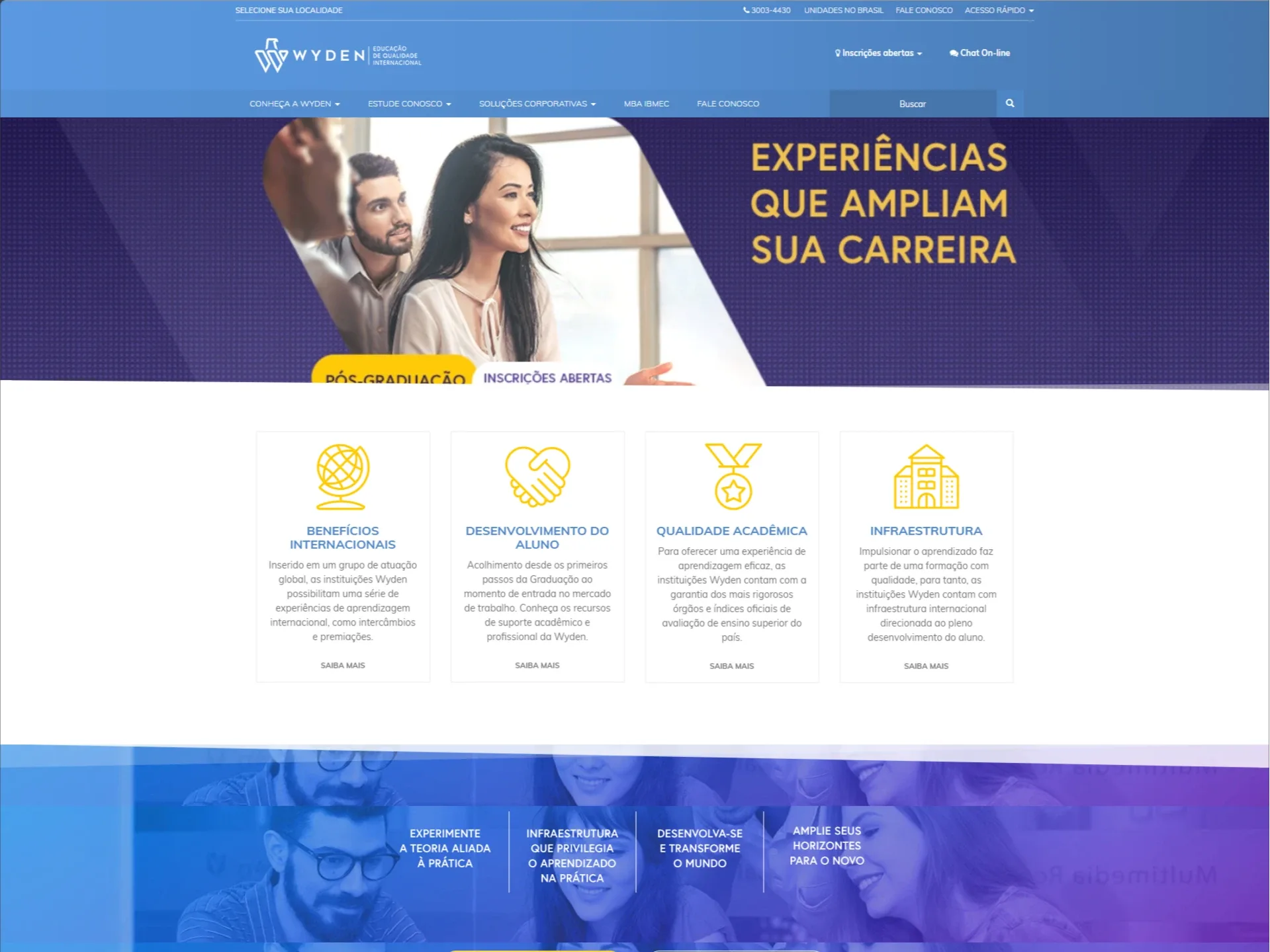
Wyden Portal
Designing a scalable digital experience for a rebranded education ecosystem
Overview
As Lead Product Designer, I was responsible for the end-to-end design of the Wyden portal, owning both UX and UI.
The project was part of a strategic transformation, transitioning from DeVry Brasil to Wyden. This shift required more than a visual update. It demanded a complete rethinking of the digital experience to support a unified brand across a complex network of institutions.
My role was to translate this transformation into a clear, scalable, and conversion-oriented product. The result was a platform that improved usability, strengthened brand perception, and supported growth during a critical rebranding phase.
About the Client
Wyden is a Brazilian higher education network created from the rebranding of DeVry Brasil, consolidating multiple institutions under a unified identity.
The group operates across different regions, offering undergraduate and postgraduate programs in multiple formats, including on-campus, hybrid, and online education. With thousands of students and a growing footprint, Wyden represents a complex ecosystem of brands, campuses, and academic offerings.
This scale introduced a key challenge: how to unify the experience without losing the identity of each institution.
Context
The portal redesign was directly tied to the brand transition.
Previously, the digital ecosystem reflected a fragmented structure, with multiple institutions operating with limited consistency. The rebranding to Wyden introduced the need for:
A unified digital presence
A clearer positioning aligned with growth and opportunity
A more scalable structure to support expansion
A stronger connection between brand and user experience
This positioned the portal as a core product for both brand consolidation and user acquisition.
The Challenge
The existing experience presented several critical issues:
Fragmented identity across institutions
Complex and inconsistent navigation
High cognitive load during course exploration
Weak connection between brand and digital experience
Limited scalability for future growth
The core challenge was:
How to unify multiple institutions into a single coherent digital experience while preserving their individuality.
My Role
I led the product design end-to-end, with full ownership of UX and UI.
Defined the overall product experience aligned with the new Wyden brand
Designed the full information architecture for a multi-institution ecosystem
Created all key user journeys and navigation flows
Designed the entire UI layer and visual system
Established consistency across pages, components, and interactions
Translated brand strategy into a functional digital experience
Collaborated with stakeholders to align business and user needs
This was a full ownership role, from structure to final interface.
Objectives
The redesign focused on four strategic goals:
Unify the digital experience
Support the rebranding strategy
Improve user decision-making
Build a scalable system
Approach
1. Aligning Product with Brand
The first step was translating Wyden?s new positioning into digital principles:
Clarity and accessibility
Perception of scale and credibility
Consistency across institutions
Balance between local identity and unified brand
2. Information Architecture for Scale
I designed a flexible structure capable of supporting growth:
Unified navigation across institutions
Clear separation between brand, courses, and campuses
Reduced depth in key journeys
Logical grouping based on user intent
3. End-to-End User Journey Design
I redesigned all critical flows:
Course discovery
Institution exploration
Campus navigation
Conversion flows such as enrollment and contact
Each journey was optimized to reduce friction and improve clarity.
4. UI Design and Systemization
I created a scalable and consistent interface:
Strong visual hierarchy
Modular components
Consistent patterns across pages
Improved readability and scannability
The UI reinforced a modern, structured, and trustworthy brand perception.
Solution
The final portal delivered a unified, scalable, and user-centered digital experience aligned with the new Wyden identity.
Key Improvements
Unified multi-institution navigation
Clear and structured content hierarchy
Consistent visual system
Simplified and guided user journeys
Stronger alignment between brand and experience
Scalable architecture for future growth
Results
Quantitative Impact
+34% increase in course page engagement
+28% increase in lead conversion rate
-25% reduction in bounce rate on entry pages
+42% improvement in navigation efficiency
+19% increase in average session duration
+23% increase in CTA click-through rate
-31% reduction in navigation drop-offs
Qualitative Impact
Strong perception of a unified and modern brand
Reduced confusion across institutions and offerings
Faster and more confident decision-making
Increased trust and perceived academic quality
More intuitive and predictable navigation
Better alignment between brand positioning and digital experience
Business Impact
Enabled a successful digital transition during rebranding
Strengthened the portal as a primary acquisition channel
Reduced fragmentation across digital touchpoints
Supported brand consolidation across multiple institutions
Created a scalable foundation for future growth
Key Design Decisions
Unify without losing identity
Each institution remained recognizable while being part of a cohesive system.
Design for scale
The structure was built to support expansion from the start.
Translate brand into experience
The rebranding was reflected not only visually, but structurally and functionally.
Reduce complexity through organization
Clarity was achieved by structuring information, not reducing it.
Learnings
Rebranding at scale is not just a visual exercise.
It is a product challenge.
Success depends on how well the new identity is translated into real user experiences across complex systems.
Tools and Methods
Product Design
UX and UI Design
Information Architecture
Design Systems Thinking
User-Centered Design
Digital Strategy