Perfeito, Rafael. Isso muda bastante o peso do case.
Se voc? foi o principal respons?vel por UX e UI, precisa deixar isso expl?cito sem soar inflado.
Ajustei o case para refletir ownership real de produto, mantendo credibilidade.
DeVry Brasil Portal
Designing clarity for a multi-brand higher education ecosystem
Overview
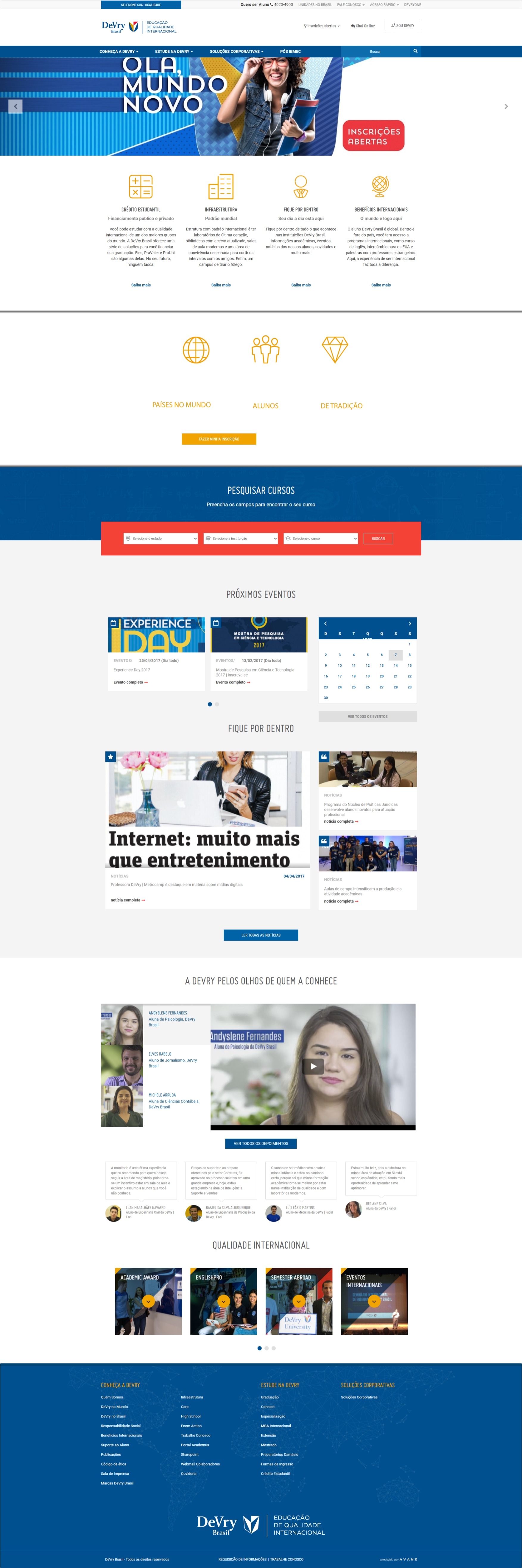
As the Lead Product Designer, I was fully responsible for the end-to-end design of the DeVry Brasil portal, covering both UX and UI.
The project involved redesigning a large-scale digital platform representing a multi-institution higher education group operating across Brazil. My role was to transform a complex institutional structure into a clear, scalable, and conversion-oriented experience.
The result was a more intuitive platform that improved user engagement, strengthened brand perception, and supported business growth.
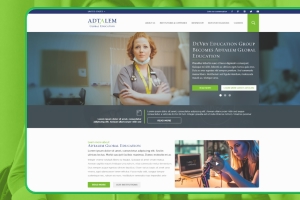
About the Client
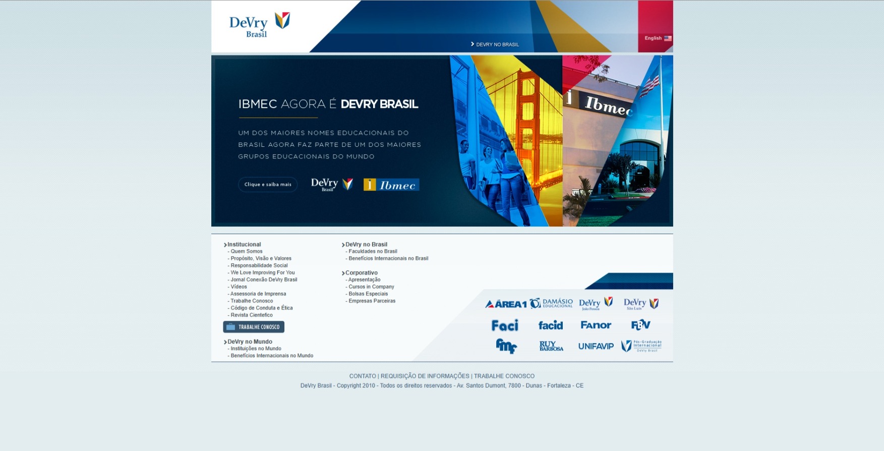
DeVry Brasil was part of a global education group, operating multiple higher education institutions across different regions. The organization managed a diverse portfolio of brands, campuses, and academic programs, serving tens of thousands of students.
This structure created a significant challenge: translating a complex, multi-layered ecosystem into a cohesive and understandable digital experience.
The Challenge
The existing portal struggled to balance institutional complexity with usability.
Key challenges included:
Fragmented navigation across multiple institutions and offerings
High cognitive load due to dense and unstructured content
Lack of clear user journeys for prospective students
Inconsistent visual and interaction patterns
Limited scalability for future growth
The core problem was clear:
How to simplify complexity without losing depth or credibility.
My Role
I led the product design end-to-end, with full ownership of UX and UI.
Defined the overall product experience and strategy
Designed the complete information architecture
Created all core user flows and navigation structures
Designed the full UI layer and visual system
Established consistency across pages and components
Balanced business goals, brand positioning, and user needs
Worked closely with stakeholders to validate decisions
This was not a partial contribution. I was responsible for shaping the product from structure to final interface.
Objectives
The project was driven by four main goals:
Simplify the user experience
Improve discovery and decision-making
Strengthen brand perception
Build a scalable foundation
Approach
1. Experience Diagnosis
I evaluated the existing experience and identified key issues:
Overloaded navigation and unclear hierarchy
Redundant content and weak structure
Misalignment between user needs and internal organization
Friction in critical journeys
2. Information Architecture Redesign
I redesigned the architecture based on user intent:
Clear content grouping
Simplified navigation
Reduced depth in key flows
Better separation between institutional and academic content
3. End-to-End UX Design
I designed all key journeys:
Institution exploration
Course discovery
Campus navigation
Conversion flows such as contact and application
Each flow was optimized to reduce friction and guide decision-making.
4. UI Design and Visual System
I designed the full interface layer, ensuring:
Strong visual hierarchy
High readability and scannability
Consistent components and patterns
A modern and credible visual language aligned with the brand
Solution
The final product delivered a clear, structured, and scalable digital platform.
Key Improvements
Intuitive navigation system
Stronger content hierarchy
Cleaner and more scannable layouts
Consistent UI patterns
Clear conversion pathways
Scalable design foundation
Drag the handle left or right to compare.
Results
Quantitative Impact
+32% increase in course page engagement
+27% increase in lead generation conversion rate
-24% reduction in bounce rate on key pages
+41% improvement in navigation efficiency
+18% increase in session duration
+22% increase in CTA click-through rate
Qualitative Impact
Higher perceived credibility and quality
Reduced cognitive load
Improved discoverability of content
Stronger alignment between brand and experience
More predictable and consistent user journeys
Business Impact
Strengthened the portal as a key acquisition channel
Reduced fragmentation across digital touchpoints
Enabled a more cohesive digital ecosystem
Created a scalable foundation for future growth
Key Design Decisions
Simplify without losing depth
The goal was not to reduce content, but to organize it better.
Design for user intent
Navigation was built around what users want to do, not internal structures.
Prioritize clarity
Every element had a clear purpose.
Build for scale
The system was designed to grow with the organization.
Learnings
In complex ecosystems, design is not about adding more.
It is about organizing complexity into something understandable.
This project reinforced the importance of treating institutional platforms as products, not just marketing assets.
Tools and Methods
Product Design
UX and UI Design
Information Architecture
Design Systems Thinking
User-Centered Design
Digital Strategy